 | |
| Category | Serif |
|---|---|
| Designer(s) | Otto Weisert |
| Foundry | Linotype |
| Re-issuing foundries | Adobe |
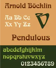
Arnold Böcklin is a typeface for display use that was designed in 1904 by Schriftgiesserei Otto Weisert foundry. It was named in memory of Arnold Böcklin, a Swiss symbolist painter who died in 1901.
Probably the best-known Art Nouveau typeface, the font had a renaissance in the 1960s and 1970s as part of the general Art Nouveau revival in popular design. Its influence can be seen in the work of illustrators such as Roger Dean and the Stuckist artist Paul Harvey.
Usages
Because it was included in early versions of CorelDRAW software under the name "Arabia", it became connected with Middle East and Oriental themes and used in a variety of contexts, from kebab restaurants to colonial shops, despite having little in common with actual Arabian lettering.
The font has been used in:
- The title of the television show That '70s Show.
- James Blunt's album Back to Bedlam.
- The title of the sitcom The Cuckoo Waltz.
- The Metro / Liceu sign over the Las Ramblas subway entrance in Barcelona.
- The logo of White Dwarf magazine from the late 1970s to the early 1980s used the font.
- The splash screen of the video game, Pharaoh's Tomb used the font.
- The band Dinosaur Jr. has used the font on various album covers.
- Early "Ram's Head" versions of the Electro-Harmonix Big Muff used the font.
- It was used on the title screen of the 1987 videogame, Solomon's Key, developed and released by Tecmo for the Nintendo Entertainment System.
- The 1989 videogame Hippodrome by Data East used it on the title screen.
- The British band Jamiroquai used it for the design of their first album release Emergency on Planet Earth.
- The Moody Blues album cover for Every Good Boy Deserves Favour (1971) designed by Phillip Travers.
- The British café chain Patisserie Valerie in its wordmark logo.
- The American band The Turtles used it on their album Happy Together.