 | |
| Category | Serif |
|---|---|
| Classification | Old-style |
| Designer(s) | Jonathan Hoefler |
| Foundry | Hoefler & Co. |
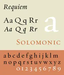
Requiem is an old-style serif typeface designed by Jonathan Hoefler in 1992 for Travel + Leisure magazine and sold by his company, Hoefler & Co.[1][2] The typeface takes inspiration from a set of inscriptional capitals found in Ludovico Vicentino degli Arrighi's 1523 writing manual, Il Modo de Temperare le Penne, and its italics are based on the chancery calligraphy, or cancelleresca corsiva of the period.[3]
Like many other typefaces designed by Hoefler & Co., the family is large, intended for professional use. It is designed with three separate optical sizes of font, intended for different sizes of text, as well as two different styles of capitals inside cartouches intended for title pages and frontispieces.[4][5] It also contains fleurons and italic ligatures inspired by calligraphy, as well as stylistic alternates such as an alternative 'Y' character.[6][7] Like typefaces of the period in which Arrighi worked, it does not contain a bold style, as these were only invented in the nineteenth century.[8]
Variants
Three optical sizes, with regular (or roman) and italic styles for each:
- Requiem Fine: for very large sizes, especially thin serifs and overall stroke weight
- Requiem Display: for large sizes
- Requiem Text: for body text, higher x-height
There are no small caps in the italic styles.[8]
- Requiem Display Ornaments: cartouches for large sizes
- Requiem Text Ornaments: cartouches for small sizes
Some releases of Requiem may also contain small caps, italic ligature and fleuron characters as separate fonts.[8]
Uses
- The title and credits of the movie Signs.
- The title and credits of the movie Pride & Prejudice.
- The feline novel series Warriors by Erin Hunter.
- The novel Cloud Atlas by David Mitchell.
- The opening credits of the CBS series Ghost Whisperer.
- The opening credits of the NBC series Hannibal.
- The novel Americanah by Chimamanda Ngozi Adichie
- Marshall McLuhan’s republished doctoral dissertation
See also
Hoefler Text - old-style serif design, also by Jonathan Hoefler, with bold styles, swashes and a wider range of arabesque designs; also matching titling face Hoefler Titling.[9][10]
References
- ↑ "Requiem Overview". Hoefler & Frere-Jones. Retrieved 16 August 2015.
- ↑ Coltz, Jon. "Questions about Requiem for Jonathan Hoefler". daidala (archived). Archived from the original on 16 March 2007. Retrieved 24 June 2018.
- ↑ Paul Shaw (2017). Revival Type: Digital Typefaces Inspired by the Past. Yale University Press. pp. 26–7. ISBN 978-0-300-21929-6.
- ↑ "Requiem optical sizes". Hoefler & Frere-Jones. Retrieved 16 August 2015.
- ↑ "Requiem ornaments & cartouches". Retrieved 16 August 2015.
- ↑ "Italic ligatures".
- ↑ "Special characters". Retrieved 16 August 2015.
- 1 2 3 "Requiem styles". Retrieved 16 August 2015.
- ↑ Hoefler Text | Hoefler & Frere-Jones. Retrieved November 18, 2009.
- ↑ "Hoefler Titling". Hoefler & Frere-Jones. Retrieved 7 July 2015.
- Dodd, Robin. From Gutenberg to Open Type. Hartley & Marks: 2006. ISBN 978-0-88179-210-2.
- Macmillan, Neil. An A–Z of Type Designers. Yale University Press: 2006. ISBN 978-0-300-11151-4.
- Typography.com, Hoefler & Frere-Jones' Web site page on Requiem
External links
- Columbia.edu, Specimen of Arrighi's cancelleresca corsiva
- Fonts In Use website - prominent uses of Requiem