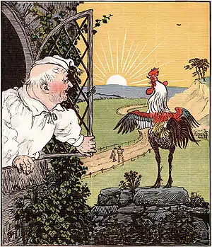
Edmund Evans (23 February 1826 – 21 August 1905) was an English wood-engraver and colour printer during the Victorian era. He specialized in full-colour printing, a technique which, in part because of his work, became popular in the mid-19th century. He employed and collaborated with illustrators such as Walter Crane, Randolph Caldecott, Kate Greenaway and Richard Doyle to produce what are now considered to be classic children's books. Little is known about his life, although he wrote a short autobiography before his death in 1905 in which he described his life as a printer in Victorian London.
After finishing an apprenticeship, Evans went into business for himself. By the early 1850s, he had established a reputation as a printer of covers for a type of cheap novels known as yellow-backs. In the early 1860s, he began to print children's toy books and picture books in association with the printing house Routledge and Warne. His intention was to produce books for children that were beautiful and inexpensive. For three decades he produced multiple volumes each year, first illustrated by Crane, and later by Caldecott and Greenaway.
Evans used a woodblock printing technique known as chromoxylography, which was used primarily for inexpensive serialised books and children's books requiring few colours, so as to maximize profits. However, chromoxylography allowed a variety of hues and tones to be produced by mixing colours. The process was complicated and required intricate engraving to achieve the best results. Evans possessed a meticulous eye for detail and used a hand-press and as many as a dozen colour blocks for a single image. He went on to become the preeminent wood engraver and colour printer in Britain during the second half of the 19th century.
Apprenticeship and early work
Evans was born in Southwark, London, on 23 February 1826, to Henry and Mary Evans.[1] He attended school in Jamaica Row, where he enjoyed mathematics but wished he had learned Latin.[2] As a 13-year-old he began work as a "reading boy" at the printing house of Samuel Bentley in London in 1839.[1] However, he was reassigned as a general errand boy because his stutter interfered with his duties. The hours were long—from seven in the morning until nine or ten at night—but the printmaking process itself, and the books produced by the establishment, fascinated Evans.[2] Bentley soon realized the boy was talented after seeing his early attempts at scratching illustrations on slate, and arranged for Evans to begin an apprenticeship with wood-engraver Ebenezer Landells.[3]
Evans started with Landells in 1840. His duties included delivering proofs of drawings to be approved by artists such as Edward Dalziel, or authors such as Charles Dickens.[2][4] A year later, Landells launched Punch magazine, and as early as 1842 had Evans illustrate covers for the new publication.[5] Evans worked and became friends with Myles Birket Foster, John Greenaway and George Dalziel.[6] Foster and Evans became lifelong friends. When Landells received a commission from the Illustrated London News to provide illustrations of Queen Victoria and Prince Albert, he sent Evans and Foster to Balmoral to make sketches, which Evans engraved.[4] Toward the end of his apprenticeship, the demands of the Illustrated London News caused Evans to work late into the night and return early in the morning.[7]

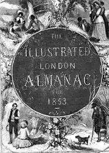
When his apprenticeship ended in 1847, Evans, then 21, refused an offer of employment from Landells, deciding instead to go into business for himself as a wood-engraver and colour printer. In 1848 Evans engraved a title-page illustration, among other commissions, for the Illustrated London News. However, the Illustrated London News stopped employing him on the basis that his wood engraving was too fine for newspaper work. His final print for the Illustrated London News showed the four seasons, and was illustrated by Foster. In fact Foster received his first commission from the publisher Ingram, Cook, and Company to reproduce the four scenes in oil.[8] In 1851, Ingram chose Evans to engrave three prints for Ida Pfeiffer's Travels in the Holy Land. He used three blocks for the work: the key-block, outlining the illustration, was printed in a dark-brown hue; the other two were in a buff colour and a grayish-blue colour. For the same firm, Evans completed an order for a book-cover using bright reds and blues on white paper.[3] That year he received the first commission to print a book, written by Fanny Fern and illustrated by Foster.[8] Evans had enough business to apprentice his two younger brothers, Wilfred and Herbert,[1] and to buy a hand-press. Soon he moved his premises to Racquet Court, and bought three more hand-presses.[8]
In the early 1850s, Evans designed book-covers known as yellow-backs, a "book bound in yellow-glazed paper over boards". He perfected the method and became the printer of choice for many London publishers;[9] by 1853 he was the chief yellow-back printer in the city.[10] He developed the yellow-back as he disliked the white paper book-covers that became soiled and discoloured; as a result of this aversion he experimented with yellow paper by treating before adding the printed illustration.[3] Often yellow-backs were used for unsold editions, so that they functioned as reprints or waste; typically "enormous number of these covers" were left behind for publishers.[3] Other terms for the books were "Penny dreadfuls", "railway novels" and "mustard plaisters".[11] For the illustrations, Evans commissioned artists such as George Cruikshank, Phiz, Randolph Caldecott and Walter Crane.[9] Evans' first cover was brightly coloured, utilising only reds and blues, overprinting blue over black to create what appeared as a black background. He continued the practice of using red and blue, engraving "in graduation" for lighter tints of reds used for faces and hands, and engraving the blue blocks in a manner that created textures and patterns.[8] Evans realised books that may have been unsuccessful in a first printing were easy to sell with well-designed cover art.[5]
.jpg.webp)
In the mid-1850s, Evans and Foster visited Scotland to create sketches for a series of guide books, which Evans printed. He later engraved Foster's illustrations for Lady of the Lake, and Foster's illustrations for The Poetical Works of George Herbert (1856), printed in Edinburgh. Of the George Herbert engravings he states: "these illustrations I consider the best that I ever engraved".[12] By 1856 Evans had "perfected a process of colour printing from wood blocks",[13] and achieved a reputation as the preeminent wood engraver and best colour printer in London.[14][15]
In the late 1850s Evans worked on an edition of The Poems of Oliver Goldsmith, illustrated by Foster, published in 1859. The volume was successful enough to warrant a second edition, with 11 more colour-printed illustrations, which was published in 1860. During the 1860s, his most notable work was for James Doyle's A Chronicle of England,[10] which includes 80 illustrations, and is considered evidence of his capability as a master of colour.[16] His method of coloured wood engraving allowed for watercolours to be reproduced, and was used for The Art Album: Sixteen Facsimiles of Water-colour Drawings, which he engraved and printed in 1861.[15] Before he began printing children's books, much of Evans' business was to provide colour printwork for magazines[17] such as Lamplighter, The Sunday School Companion and Chatterbox.[18] With increased print orders, Evans leased space on Fleet Street to expand the business, adding steam engines, boilers and "many extra machines".[19]
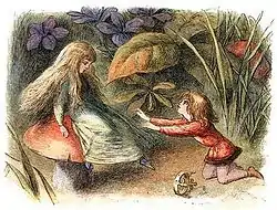
From the late 1850s to the early 1860s, Evans produced the blocks and printed for, among others, books illustrated by William Stephen Coleman including, Common Objects of the Sea Shore, Common Objects of the Country, Our Woodlands, Heaths, and Hedges, and British Butterflies. The printing process used up to 12 colours and, as was his usual practice, a hand-press. During these years he also completed work on Foster's Bible Emblem Anniversary Book, and Little Bird Red and Little Bird Blue.[20] In 1870, Evans printed In Fairyland, a Series of Pictures from the Elf-World, illustrated by James Doyle's brother Richard in which Doyle depicted fairies living "among birds, snails, butterflies and beetles as large as themselves", and Evans produced his largest wood-engravings for the volume.[21] The 36 illustrations contained within are "often considered the masterpiece of Victorian illustration."[22] During the 1860s and 1870s, he was employing up to 30 engravers.[1]
In 1864, Evans married Mary Spence Brown, Foster's niece, and the couple lived in Witley, Surrey. Foster was their neighbour, as was George Eliot.[1][23] Commenting on his work, Evans said that it "kept me fully employed mind and body: I had to direct the engravers to the direction of the lines in the colour blocks, and the printers for the tones of the inks for printing, often mixing the inks". Whenever possible he visited Brighton, where he enjoyed the air.[24]
Process and techniques
During the Victorian period, the art of book illustration gained popularity, supported through the work of wood engravers. Woodcut extended back centuries in Europe and further in Asia. Typically the parts to be printed in black were left in relief by the carver, allowing illustrations to be printed along with the text. Thomas Bewick developed the technique in the 18th century and "perfected the process that was used extensively throughout the 19th century, which necessitated the use of hardwood blocks and tools for metal engraving".[25] The preferred method of relief engraving had been to work with the grain on the plank side of a block; however Bewick worked the end of the block and carved against the grain using a burin.[26] Bewick passed his techniques to apprentices, including Landells, who in turn passed them to Evans. In the 1860s, Thomas Bolton developed a method for transferring a photographic image onto block, which enabled the engraver "to work on the surface".[25]
In the 1830s George Baxter repopularised colour relief printing, known as chromoxylography, by using a "background detail plate printed in aquatint intaglio, followed by colours printed in oil inks from relief plates—usually wood blocks". Evans followed the Baxter process, with the modification of using relief wood blocks only.[16] For The Poems of Oliver Goldsmith, Evans created a facsimile of a watercolour, by superimposing colours with the use of separate colour blocks, one by one, to achieve the graduated colours of the original.[27] First, Foster drew the illustration directly on the woodblocks that were to be cut, and he then recreated a coloured paper copy of the drawing. Evans, using the same pigments as Foster, grinding them himself, produced inks to match Foster's colours. The printing was done using a hand-press, with nine or ten print runs required for each illustration.[15] For A Chronicle of England, Evans engraved prints dropped into the text at six-page intervals.[28] Doyle drew the illustrations directly onto the wood blocks and created coloured proofs. Nine or ten wood blocks (colour blocks) were used for each of the 80 illustrations, which Evans again printed on a hand-press.[20] The use of colour and the ability to create subtle tones are characteristic of Evans' skill as a colourist.[16] His work was distinctive because of the characteristic quality of the wood engraving (carving) and his manner of limiting the use of ink to create a more striking result.[29]
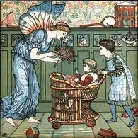
Evans' process involved a number of steps. First, the line drawing of an illustration was photographed and printed onto block while the line drawing was engraved.[30] Proofs of the key block were coloured by the illustrator; Evans would then "determine the sequencing and register ... to arrive at a close reproduction of the artist's original".[31] Blocks were painted and engraved; one for each colour. A proof of each colour block was made before a final proof from the key block. Ideally, the proof would be a faithful reproduction of the original drawing, but Evans believed a print was never as good as a drawing. He took care to grind and mix his inks so they closely emulated the original. Finally, each block was placed so as to allow the individual colours to print on the page exactly as intended. Aware of costs and printing efficiencies, he used as few colours as possible.[30] Illustrations were produced with a base of black, along with one or two colours and a flesh tone for faces and hands. In some cases, Evans may have used as few as four colour blocks: likely black, flesh and two primary colours; the addition of yellow allowed him a greater range.[32] Each colour was printed from a separately engraved block; there were often between five or ten blocks.[33] The chief problem was to maintain correct register, achieved by placing small holes in precise positions on each block to which the paper was pinned. If done correctly, the register of colours match, although sometimes ink squash is visible along the edges of an illustration.[34]
Often the artist drew the illustration in reverse, and directly onto a block; in other cases the printer copied the illustration from a drawing. After the 1860s, images could be photographically projected onto the blocks, although it was more difficult for the printer to carve the reliefs without leaving the distinctive lines of the illustration.[35] Books printed by Evans have been reproduced using some of the original blocks which have "remained in continuous use for over a century".[33][Note 1]
Children's books
Critics regard Evans' most important work to be his prints of children's books with from the latter part of the century with Walter Crane, Kate Greenaway, and Randolph Caldecott which revolutionized children's publishing.[10] Early in the century children's book were often hand colored, and the chromoxylography processes Evans perfected "brought an immense improvement in coloured picture books for children in the last quarter of the century".[37] In 1865, Evans agreed with publishing house Routledge and Warne to provide toy books—paperbound books of six pages, to be sold for sixpence each. They "revolutionized the field of children's books" and lent Evans his association with children's book illustrators.[10] The market for toy books became so great that he began to self-publish and commission the artists for illustrations.[1] When demand swelled beyond his capacity, he employed other engraving firms to fill the orders.[38]

The concept of a picture book for children, with the art dominating the text rather than illustrations supplementing the text, was an invention of the mid-19th century.[39] According to Judith Saltman of the University of British Columbia, Evans' work as a printer of children's picture-books is particularly notable; she believes he printed the "most memorable body of illustrated books for children" in the Victorian era, and the three illustrators, whose works he printed, can be regarded as the "founders of the picture-book tradition in English and American children's books".[13] He considered full-colour printing a technique well-suited to the simple illustrations in children's books.[15] Evans reacted against crudely coloured children's book illustrations, which he believed could be beautiful and inexpensive if the print run was large enough to maintain the costs.[40] In doing so, Evans hired Walter Crane, Kate Greenaway and Randolph Caldecott as illustrators,[41] all of whom became successful because of Evans' "recognition, encouragement, and brilliant colour reproduction".[Note 2]
Walter Crane
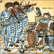
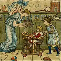
In 1863, Evans employed Walter Crane to illustrate covers for inexpensive novels sold in railroad stations called "yellow backs"—after their yellow covers.[43] In 1865, they began to collaborate on toy books of nursery rhymes and fairy tales.[19] Between 1865 and 1876, Crane and Evans produced two or three toybooks a year.[43] The earliest of the series (which grew in popularity) showed only two colours—red and blue—with black or blue used for the key block.[11] Crane illustrated the early books, printed by Evans, This Is the House That Jack Built and Sing a Song of Sixpence, in which the simple designs are presented without background ornamentation and printed only in red, blue and black.[11] Between 1865 and 1886, Crane illustrated 50 toybooks, all of which were engraved and printed by Evans.[44] These commercially successful books established Crane as one of the most popular illustrators of children's books in England.[43]
Crane drew his designs directly on the blocks.[38] The designs gradually became more elaborate, as Crane became influenced by Japanese prints.[11] In 1869, Evans added yellow, which he mixed with red and blue to create a greater variety of hues.[43] The following year, Crane was given a set of Japanese prints and, impressed with "the definite black outline, the flat brilliance as well as delicate colours" he applied the techniques to toy book illustrations.[45] His interest in design details, such as furniture and clothing, are reflected in his illustrations.[38] During these years Crane and Evans worked for the publishing house Routledge and collaborated on books such as The Yellow Dwarf, Beauty and the Beast, Princess Belle – etoile, and Goody Two Shoes. Crane sold his illustrations directly to the publisher and, with printing and engraving expenses, large print runs were required.[46]
Crane was abroad from 1871 to 1873 while Evans continued to print his work. Evans received Crane's illustrations via post, photographed the image to the keyblock to be engraved, and then returned a proof to Crane for colouring.[47] In 1878 Crane and Evans collaborated on The Baby's Opera, a complex project with a dozen fully illustrated pages, and decorative borders on each of the 56 pages.[43] Crane visited Evans at his home in Witley to design the book. Evans gave Crane a dummy book to design the layout of the entire volume. The first print run consisted of 10,000 copies, but Evans quickly added more as demand for the volume grew.[23] Evans added more hues to the illustrations, with "light blues, yellows, and brick reds, delicately blended" replacing the brighter colours of earlier work.[48]
In 1880, Crane illustrated and Evans printed, The Baby's Bouquet: a Fresh Bunch of Old Rhymes and Tunes, which went on to sell hundreds of thousands of copies. The book shows influences ranging from the Pre-Raphaelites, Japanese art to the incipient arts and crafts movement.[15] In 1889, Flora's Feast: A Masque of Flowers was published, featuring flowers represented as human figures, for which Evans used as many as eight colour blocks.[49] Their later collaborations includes an edition of Alice in Wonderland with coloured versions of John Tenniel's 1890 illustrations, and the 1899 A Floral Fantasy in an Old English Garden.[10]
Randolph Caldecott

The pressure of such steady production caused Crane to stop his work for a period, and Evans replaced him with Randolph Caldecott, whose magazine illustrations he had seen and liked.[50] Initially Evans hired Caldecott to draw illustrations for nursery rhyme books,[51] beginning with another printing of The House that Jack Built in 1877.[52] Evans proposed to fill each page with an illustration, which were "often little more than outlines" to avoid the blank pages which were customary in toy books of the period.[53] In 1878 The Diverting History of John Gilpin was published, illustrated by Caldecott and printed by Evans.[40] Evans supplied Caldecott with materials for the illustrations and payment based on sales quantities. Evans explained the business arrangement:
I agreed to run all the risks of engraving the key blocks which he drew on wood; after he finished colouring a proof I would furnish him, on drawing paper, I would engrave the blocks to be printed in as few colours as necessary ... the key block in dark brown, then a flesh tint for the faces, hands, and wherever it would bring the other colours as nearly as possible to his painted copy, a red, a blue, a yellow and a grey.[53]
Beginning in 1878 through 1885, Caldecott illustrated two books a year for Evans, and secured his reputation as an illustrator.[50][54] The books were released for the Christmas season, when sales would be sufficient to warrant print runs as large as 100,000. Later, collected editions of four works reprinted in a single volume were published.[55] Throughout the late 1870s, Evans and Caldecott collaborated on 17 books, considered Caldecott's best, and to have changed the "course of children's illustrated books".[40] Caldecott drew pen and ink illustrations on plain paper that were photographed to wood. Evans "engraved in facsimile" the illustration to the woodblock.[53] Six blocks (one for each colour) were used to create a multi-colour "image of extremely delicate quality".[40]
Caldecott died of tuberculosis in 1886,[40] and the following year Evans printed a collection of his picture books, titled The Complete Collection of Pictures & Songs.[56] Ruari McLean explains in the introduction to Evans' Reminiscences, that as late as the 1960s reprints of Caldecott's The House that Jack Built were "astonishingly, still being printed from the plates made from the original wood-blocks engraved by Edmund Evans".[57]
Kate Greenaway
In the late 1870s, Kate Greenaway—who spent her earlier career illustrating greeting cards—persuaded her father, also in the engraving business, to show Evans her poetry manuscript, Under the Window.[58] Evans invited her to Witley, and as he explains: "I was at once fascinated by the originality of the drawings and the ideas of the verse, so I at once purchased them."[59] Evans believed her illustrations to be commercially appealing and encouraged Routledge to publish the book.[60] Of Greenaway's first collection of illustrations and verse, Evans writes:
After I had engraved the blocks and colour blocks, I printed the first edition of 20,000 copies, and was ridiculed by the publishers for risking such a large edition of a six-shilling book; but the edition sold before I could reprint another edition; in the meantime copies were sold at a premium. Reprinting kept on till 70,000 was reached.[61]
.jpg.webp)
When George Eliot saw Greenaway's drawings, while visiting the Evanses at their home, she "was much charmed by them", however, she refused Evans' request to write a children's story to be illustrated by Greenaway.[62] Published in 1879, Evans produced 100,000 copies of Under the Window (including French and German editions) which helped launch Greenaway's career as an author and illustrator of children's books.[63][64] For Under the Window, Evans paid Greenaway outright for her artwork, and royalties up to one-third of proceeds, after the costs of printing; for subsequent books he paid half of the proceeds after deducting the printing costs.[61] Evans photographed Greenaway's drawings to wood, engraved in facsimile, and created colour blocks of red, blue, yellow and flesh tint.[65]
Evans paid particular attention to detail in the printing of her Mother Goose. The "antique look" added to the Regency style artwork, while his ink and colouring choices conveyed the look of a hand-coloured book suitable for a mass-market edition. To achieve the antique look, rough paper was pressed and printed, with the roughness restored after printing by dipping the paper in water. As an example of 19th-century book production, Mother Goose is considered exceptional, and facsimiles were printed well into the mid-20th century.[31]
During the 1880s, Evans printed two to three Greenaway books a year, including a run of 150,000 copies of Kate Greenaway's Birthday Book (1880),[66] as well as Mother Goose (1881), The Language of Flowers (1884), Marigold Garden (1885), The Pied Piper of Hamelin (1887), and King Pepito (1889).[61] From the mid-1880s to the mid-1890s Evans printed, and Greenaway illustrated, nine almanacs—one each year.[67] Greenaway benefitted from her association with Evans. As the leading publisher of children's books, Routledge provided Greenaway with a commercial base she may not have achieved without Evans' influence. Children's literature scholar Anne Lundin claims the distinctive quality of Evans' printing, as wells as his popularity as a children's book printer, linked Greenaway's name with his, thereby increasing her commercial appeal.[29] Greenaway often visited the Evans family, played with their three daughters and continued to visit Evans after his move to Ventnor.[68] During her career as an illustrator, Greenaway used Evans as sole engraver and printer.[57]
Later work and retirement
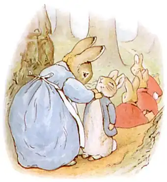
Evans eventually converted to the three-colour printing technique.[69] In 1902 he used the "recently developed Hentschel three-colour process", at Beatrix Potter's request, to print her watercolour illustrations for her first book, The Tale of Peter Rabbit.[49] Towards the end of his career, not all of his work was devoted to the three-colour process; in 1902 he engraved and printed Old English Songs and Dances for W. Graham Robertson, which was described as "harmonious" and "delicate".[70]
In 1892, Evans moved to Ventnor on the Isle of Wight, and turned the printing business over to his sons Wilfred and Herbert, although when he stopped engraving wood is unknown.[57] During his last decade he wrote The Reminiscences of Edmund Evans, a short volume he described as "the rambling jottings of an old man".[71] In that book Evans includes few details of his business practices and processes, and is significant because it adds to the scant information available on the colour printers of the era.[57] In the 1960s, Ruari McLean edited the unrevised 102-page typescript released to him by Evans' grandson which was published by the Oxford University Press in 1967.[71]
Evans died in 1905, and is buried in Ventnor cemetery.[71] He was survived by his two sons and three daughters. The firm was bought in 1953 by W. P Griffith, Ltd; Evans' grandson Rex became managing director.[1] Before his death Evans offered Beatrix Potter an interest in the company which she refused, having recently bought a farm in the Lake District.[72]
A substantial number of Evans' original engraved wooden blocks are held at the St Bride Printing Library in London.
Additional Evans images

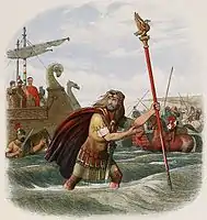 -->Evans used as many as ten colour blocks for the prints in A Chronicle of England, illustrated by James Doyle, and printed in 1864.[28]
 Caldecott's illustrations in The Fox Jumps Over the Parson's Gate (1883) show the subtle blend of colours Evans achieved with only a few colour blocks.[40]
 -->The Pied Piper of Hamelin (1888) shows subtle colour squashing on the piper's robe, and the use of cross hatchings to blend colours, characteristics of chromoxylography.[73]
Detail of John Gilpin
 Image from The Diverting History of John Gilpin
References
Notes
- ↑ On page viii of The Caldecott Aesop: Twenty Fables : A Facsimile of the 1883 Edition, a production note states that the "majority of color plates were made from the first woodblock renderings of Caldecott's work". The statement is not sufficiently clear to indicate to what extent the original blocks were used, however the cracks in the colour plates suggest that the original blocks may in fact have been used.[36]
- ↑ "Edmund Evans, who had printed Richard Doyle's pictures for William Allingham's poem In Fairyland in a range of subtle colours in 1870, was the key figure to whom the trio of great illustrators of the end of the century, Walter Crane, Kate Greenaway and Randolph Caldecott, owed recognition, encouragement and brilliant colour reproduction."[42]
Citations
- 1 2 3 4 5 6 7 McLean, Evans
- 1 2 3 Evans, pp. 4–7
- 1 2 3 4 Hardie, pp. 266–268
- 1 2 Evans, pp. 9–10
- 1 2 Spielmann Punch, pp. 445–446
- ↑ Spielmann, Punch, p. 16
- ↑ Evans, p. 14
- 1 2 3 4 Evans, pp. 20–26
- 1 2 Ray, p. 64
- 1 2 3 4 5 Ray, p. 149
- 1 2 3 4 Crane, pp. 74–76
- ↑ Evans, p. 30
- 1 2 Saltman, p. 211
- ↑ Hildebrand, Ryan (2006). "Picture This: Five Centuries of Book Illustration" (PDF). The UC Irvine Libraries. University of California. p. 7. Archived from the original (PDF) on 28 January 2012. Retrieved 18 July 2010.
- 1 2 3 4 5 6 "Color Printing in the Nineteenth Century". University of Delaware Library. Retrieved 28 February 2010.
- 1 2 3 Pankow, p. 22
- ↑ Spielmann, p. 56
- ↑ Evans, pp. 41–42
- 1 2 Evans, p. 32
- 1 2 Hardie, p. 269
- ↑ Ray, p. 90
- ↑ Susina, p.233
- 1 2 Crane, pp. 178–180
- ↑ Evans, p. 49
- 1 2 Lundin, "Victorian Horizons"
- ↑ Gasgoigne, section 6.a
- ↑ Hardie, p. 272
- 1 2 Ray, p. 150
- 1 2 Lundin, Sensational Designs, pp. 163–164
- 1 2 Spielmann, pp. 64–65
- 1 2 Alderson, 1989
- ↑ Gasgoigne, section 23.c
- 1 2 Wellon, Arvon (2001). "Wood Engraving". The Cambridge Guide to Children's Books in English. Cambridge University Press. Retrieved 18 July 2010.
- ↑ Gasgoigne, section 68
- ↑ Gasgoigne, section 6.c
- ↑ Richardson, p. 33
- ↑ Hunt, p. 164
- 1 2 3 McNair, 1987
- ↑ Hunt, p. 674
- 1 2 3 4 5 6 "Randolph Caldecott Papers". de Grummond Collection. University of Southern Mississippi. Retrieved 28 February 2010.
- ↑ "Picturebooks". The Cambridge Guide to Children's Books in English. Cambridge University Press. 2001. Retrieved 18 July 2010.
- ↑ "illustration in children's books". The Cambridge Guide to Children's Books in English. Cambridge University Press. 2001. Retrieved 18 July 2010.
- 1 2 3 4 5 "Illustrated Books by Walter Crane" (PDF). Library and Archives. National Gallery of Canada. January 2007. Archived from the original (PDF) on 21 July 2011. Retrieved 22 July 2010.
- ↑ McLean, p. xvi
- ↑ Crane, p. 107
- ↑ Crane, pp. 152–156
- ↑ Crane, pp. 147–148
- ↑ Hardie, p. 274
- 1 2 "Historical survey of children's literature in the British Library". The British Library. Retrieved 30 May 2010.
- 1 2 Ray, p. 154
- ↑ Lundin, Beyond Ivory Towers, p. 73
- ↑ Crane, p. 183
- 1 2 3 Evans, p. 56
- ↑ Richardson, p. 33
- ↑ Hegel, p. xiii
- ↑ "Library of Congress Online Catalog". Library of Congress. Retrieved 24 May 2010.
- 1 2 3 4 McLean, p. xvii
- ↑ Lundin, Anne. "In A Different Place: Feminist Aethestics in the Picture Book" (PDF). pdf. Retrieved 1 March 2010.
- ↑ Evans qtd. in Spielmann, p. 57
- ↑ Ray, p. 466
- 1 2 3 Spielmann, p. 58
- ↑ Evans qtd. in Spielmann, pp. 57–58
- ↑ "Kate Greenaway's Almanack for 1883". Special Collections: Item of the month. The University of Southern Mississippi. March 2009. Retrieved 18 July 2010.
- ↑ Cunningham, Peter (2001). "Under The Window (1879)". The Cambridge Guide to Children's Books in English. Cambridge University Press. Retrieved 18 July 2010.
- ↑ Evans, p. 61
- ↑ Cunningham, Peter (2001). "Greenaway, Kate 1846–1901". The Cambridge Guide to Children's Books in English. Cambridge University Press. Retrieved 18 July 2010.
- ↑ "Calendar Girl: Kate Greenaway's Almanacs". Smithsonian Libraries. Archived from the original on 29 May 2010. Retrieved 28 February 2010.
- ↑ Evans, p. 65
- ↑ Hardy, p. 272
- ↑ Ray, p. 176
- 1 2 3 McLean, p. xviii
- ↑ Lear, p. 255
- ↑ Gasgoigne, section 55.s
Sources
- Alderson, Brian (1989). "Sendak & Co". The Lion and the Unicorn. The Johns Hopkins University Press. 13 (2): 152–159. doi:10.1353/uni.0.0154. S2CID 201743794.
- Bodmer, George (2003). "Victorian Illustrators and Their Critics". Children's Literature. 31 (1): 181–185. doi:10.1353/chl.2003.0003. S2CID 144190252.
- Crane, Walter (1907). Walter Crane: An Artist's Reminiscence. New York: The Macmillan Company.
- Caldecott, Randolph; Caldecott, Alfred (1978). Aesop (ed.). The Caldecott Aesop: twenty fables: a facsimile of the 1883 edition. Garden City, N.Y: Doubleday. ISBN 0-385-12653-0.
- Evans, Edmund (1967). Ruari McLean (ed.). The Reminiscences of Edmund Evans, Wood Engraver and Colour Printer, 1826–1905. Oxford University Press, Incorporated. ISBN 978-0-19-818126-2.
- Fraser, Adam; Banks, Tom (2004). Designer's Color Manual: The Complete Guide to Color Theory and Application. San Francisco: Chronicle Books. ISBN 978-0-8118-4210-5.
- Hardie, Martin (1906). English Coloured Books. New York: Putnam.
- Hegel, Claudette (2000). Newbery and Caldecott Trivia and More for Every Day of the Year. Westport, CT: Libraries Unlimited. ISBN 1-56308-830-4.
- Hunt, Peter; Sheila Ray (1996). International Companion Encyclopedia of Children's Literature. London: Routledge. ISBN 0-203-16812-7.
- Hunt, Peter; Dennis Butts (1995). Children's Literature: An Illustrated History. Oxford: Oxford University Press. ISBN 978-0-19-212320-6.
- Gasgoigne, Bamber (1986). How to Identify Prints (1995 ed.). New York: Thames and Hudson. ISBN 0-500-23454-X.
- "Illustrated Books by Walter Crane" (PDF). National Gallery of Canada. 2007. Archived from the original (PDF) on 21 July 2011. Retrieved 1 March 2010.
- Lear, Linda (2007). Beatrix Potter: A Life in Nature. New York: St. Martin's Griffin. ISBN 978-0-312-37796-0.
- Lundin, Anne (2004). Beyond Ivory Towers and Library: Constructing the Canon of Children's Literature. London: Routledge. ISBN 0-8153-3841-4.
- Lundin, Anne (1996). "Sensational Designs: The Cultural Works of Kate Greenaway". In James McGavran (ed.). Literature and the Child: Romantic Continuations, Postmodern Contestations. Iowa City: University of Iowa Press. ISBN 0-87745-690-9.
- Lundin, Anne H. (1994). "Victorian Horizons: The Reception of Children's Books in England and America, 1880–1900". The Library Quarterly. The University of Chicago Press. 64 (1): 30–59. doi:10.1086/602651. S2CID 143693178.
- McLean, Ruari (2004). "Evans, Edmund (1826–1905)". Dictionary of National Biography (online ed.). Oxford University Press. doi:10.1093/ref:odnb/33035. Retrieved 11 June 2010.
- McNair, John R. (1985). "Chromolithography and Color Woodblock: Handmaidens to Nineteenth-Century Children's Literature". Children's Literature Association Quarterly. The Johns Hopkins University Press. 11 (4).
- Pankow, David (2005). Tempting the palette: a survey of colour printing processes. Rochester, NY: Rochester Institute of Technology. ISBN 1-933360-00-3.
- Ray, Gordon Norton (1991). The Illustrator and the book in England from 1790 to 1914. New York: Dover. ISBN 0-486-26955-8.
- Richardson, Selma K. (Winter 1981). "Randolph Caldecott". Children's Literature Association Quarterly. The Johns Hopkins University Press. 6 (4): 32–37. doi:10.1353/chq.0.1573. S2CID 258058122.
- Saltman, Judith, ed. (1985). The Riverside Anthology of Children's Literature. Boston: Houghton Mifflin. ISBN 0-395-35773-X.
- Spielmann, M. H. (1905). Kate Greenaway. London: A and C Black. ISBN 1-4437-6122-2.
- Spielmann, M. H. (1895). The History of Punch. London: Cassell & Company.
- Susina, Jan (2000). "Dealing with Victorian Fairies". Children's Literature. The Johns Hopkins University Press. 28: 230–237. doi:10.1353/chl.0.0063. S2CID 144105541.
- Watson, Victor (2001). The Cambridge guide to children's books in English. Cambridge, UK: Cambridge University Press. ISBN 0-521-55064-5.
Further reading
- Billington, Elizabeth T.; Caldecott, Randolph (1978). "Randolph Caldecott and Edmund Evans: A Partnership of Equals". The Randolph Caldecott treasury. London: F. Warne. ISBN 0-7232-6139-3.
- OVERTON, Jacquelin Marion (1946). "Edmund Evans, color-printer extraordinary". The Horn Book Magazine. 22: 109–18.
- Spencer, Isobel (1975). Walter Crane. Macmillan Publishing Company.
External links
- Works by Edmund Evans at Project Gutenberg
- Works by Edmund Evans (illustrator) at Faded Page (Canada)
- Works by or about Edmund Evans at Internet Archive
- Works by Edmund Evans at Toronto Public Library
- Edmund Evans at Library of Congress, with 41 library catalogue records