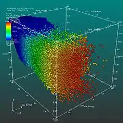
In the context of data visualization, a glyph is any marker, such as an arrow or similar marking, used to specify part of a visualization. This is a representation to visualize data where the data set is presented as a collection of visual objects. These visual objects are collectively called a glyph. It helps visualizing data relation in data analysis, statistics, etc. by using any custom notation.
In the context of data visualization, a glyph is the visual representation of a piece of data where the attributes of a graphical entity are dictated by one or more attributes of a data record.
— Matthew O. Ward, Multivariate data glyphs: Principles and practice, In: Handbook of data visualization (2008), p.180.
Constructing glyphs
Glyph construction can be a complex process when there are many dimensions to be represented in the visualization. Maguire et al proposed a taxonomy based approach to glyph-design that uses a tree to guide the visual encodings used to representation various data items.[1]
Duffy et al created perhaps one of the most complex glyph representations with their representation of sperm movement.
References
- ↑ Maguire, E.; Rocca-Serra, P.; Sansone, S. A.; Davies, J.; Chen, M. (2012-12-01). "Taxonomy-Based Glyph Design #8212;with a Case Study on Visualizing Workflows of Biological Experiments". IEEE Transactions on Visualization and Computer Graphics. 18 (12): 2603–2612. doi:10.1109/TVCG.2012.271. ISSN 1077-2626. PMID 26357169. S2CID 9350966.
Further reading
- Chen, Chun-houh; Härdle, Wolfgang; Unwin, Antony, eds. (2008). Handbook of data visualization. Springer Handbooks of Computational Statistics. Springer. ISBN 978-3-540-33036-3.