Hansje van Halem | |
|---|---|
.jpg.webp) | |
| Born | 1978 (age 45–46) |
| Nationality | Dutch |
| Occupation(s) | graphic designer, type designer |
| Years active | 2003-present |
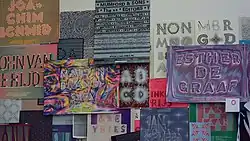
Hansje van Halem (born 1978) is a Dutch graphic designer and type designer. Her work is typified by geometric, repetitive, sometimes almost psychedelic patterns. She works at the intersection of text, illustration, pattern, colour, texture, distortions, interruptions, variations, symmetry, systematic approach and irregularities.[1] Van Halem combines the more open rules of patterns with the tighter ruleset of typography and explores the boundaries of type design. She uses the viewer’s distance to the work to move at the edge of legibility and non-legibility. In her understanding background and type should become one layer. Important to her are the process itself, “playing” around and working with trial and error. Her commissions rather revolve around the creation of identities, whole covers and patterns than individual fonts.[2]
Hansje van Halem studied graphic and typographic design at the Royal Academy of Art in The Hague from 1998 to 2000. In 2003 she subsequently graduated in Graphic Design from the Rietveld Academy. Since 2003 she has her own studio in Amsterdam. She also gives lectures, workshops, teaches and exhibits since 2003.[3]
Van Halem's designs have been exhibited in many museums, mainly in the Netherlands and the United States.[4] In 2017, a solo exhibition of her work took place at the Bijzondere Collecties van de Universiteit van Amsterdam.[5] Works by Hansje van Halem are included in the collection of the Stedelijk Museum Amsterdam.
Since 2017, she has been the head designer of the Lowlands festival, for which she works with programmers and animators.[6] In 2018, she received a Dutch Design Award for her Lowlands designs.[7]
Typeface
- WIND (2016, a Layered Typeface for Optical Illusions)[8]
Notable works

- Lowlands (2017 and ongoing, visual identity for music festival)
- Text monument K. Michel Tugelaweg - Design for a 350 meter long text monument remembering the old Jewish area as it was before WWII. Poem written for this occasion by K. Michel (2017)
- SmartGate - fence for Schiphol Airport (2016)
- Walking on Water - floor design for Roman-Catholic church St. Bonifatius on Oostzijde in Zaandam, NL (2015)
- Postage Stamps - TNT Post (2007)
Prizes / Nominations
- 2019, Best Dutch Book Design, Theory of Type Design
- 2018, Dutch Design Awards, Winner Communication with Lowlands 2018 i.c.w. Marjolein Rinckes, Jurriaan Hos and Just van Rossum
- 2011, Dutch Design Awards, Finalist Graphic Design
- 2010, Best Photography Books of the Year - Photo España - Phantom City / Kim Bouvy
- 2008, Most Beautiful Books 2007 - CO-OPs / Interterritoriale explorations in art and science
- 2005, Schönste Bücher aus aller Welt 2004, Leipzig, honorable mention
- 2005, Most Beautiful Books 2004 - Adviezen ter Voorbereiding van het Amsterdams Kunstenplan 2004 - 2008
- 2005, Most Beautiful Books 2004 - Mark, Municipal Art Acquisitions 2003 - 2004
- 2003, Most Beautiful Annual Reports 2002 - VPRO Annual Report 2002
External links
References
- ↑ "Eyemagazine Issue 98". Retrieved May 7, 2022.
- ↑ "Typographics 2017: Trial and Error with Hansje Van Halem". Retrieved May 7, 2022.
- ↑ "ABOUT - www.hansje.net". www.hansje.net. Retrieved May 7, 2022.
- ↑ "ABOUT - www.hansje.net". www.hansje.net. Retrieved Feb 4, 2020.
- ↑ Junte, Jeroen (Jul 5, 2017). "Lowlandsontwerper Hansje van Halem: 'fuck leesbaarheid, ik wil gewoon iets moois maken'". de Volkskrant. Retrieved Feb 4, 2020.
- ↑ Daniel, Diane. "How This Dutch Graphic Designer Became a Civic-Architecture Star". Architectural Digest. Retrieved Feb 4, 2020.
- ↑ "Verandering belangrijkste drijfveer voor winnaars Dutch Design Awards 2018 | Dutch Design Awards". Dec 9, 2018. Archived from the original on December 9, 2018. Retrieved Feb 4, 2020.
- ↑ "WIND Typeface". Retrieved May 7, 2022.