 | |
| Category | Sans-serif |
|---|---|
| Classification | Grotesque |
| Designer(s) | Geoffrey Lee |
| Foundry | Stephenson Blake |
| Date created | 1965[1] |
| Design based on | Anzeigen Grotesk/Neue Aurora IX[2] |
| Variations | Impact Wide |
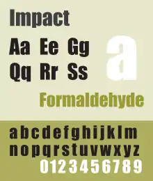
Impact is a sans-serif typeface in the industrial or grotesk style designed by Geoffrey Lee in 1965 and released by the Stephenson Blake foundry of Sheffield.[1] It is well known for having been included in the core fonts for the Web package and distributed with Microsoft Windows since Windows 98. In the 2010s, it gained popularity for its use in image macros and other internet memes.[3]
Design
Lee was an advertising design director and designed Impact with posters and publicity material in mind.[4] Its thick strokes, compressed letterspacing, and minimal interior counterform are specifically aimed, as its name suggests, to "have an impact". Impact has a high x-height, reaching nearly to three-quarters the capital line. Ascenders are short, and descenders even shorter. With narrow apertures and folded-up letterforms, the lower-case can be quite hard to read printed small, especially for people with vision problems. The face is intended for headlines and display use rather than body text.[1] As a display design, it was not released with an italic or bold weight.
During the 1960s, there was a trend towards condensed, bold, "industrial" sans-serifs like Schmalfette Grotesk and Compacta, largely pioneered by West German magazine Twen,[1] and Impact was intended to fit this trend.[5] Writing in 2004, the year before his death, Lee explained that the design goal was "to get as much ink on paper as possible in a given size with the maximum possible x-height" and to provide a home-grown metal type alternative to European designs in the style (e.g. Schmalfette Grotesk, illustrated in Lettera, a contemporary anthology series of lettering), which were complicated for British businesses to license and use.[6][7][8][9] Lee wrote that "many of us admired the vitality and colour of what we knew only as Schmalfette, and used it by old-fashioned cut and paste. Use was limited as it was never made in metal as far as I know, and existed then in capitals and numerals only".[6] (Schmalfette Grotesk was later digitised, with an added lower-case, as Haettenschweiler by Eraman Ltd.[10]) Other designs along the same lines from around the same period included the Letraset face Compacta,[8] Matthew Carter's slightly earlier masthead of Private Eye (which is caps-only but based on a never-released typeface with a lower case),[11][12] and the phototypesetting Helvetica Compressed, also by Carter and released a few years later.[13][14]
Release

Released at the end of the age of metal type as phototypesetting gained popularity, it was one of Stephenson Blake's last typefaces released in metal.[15]
The design rights were acquired by Monotype, which ultimately licensed the design to Microsoft as part of a package of fonts for use with Windows in the 1980s and 1990s.[16][17][18]
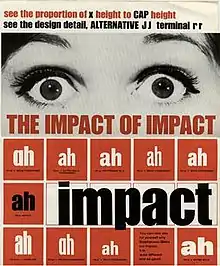
The original design contained wider alternate forms for the letters 'J' and 'r', intended for letter positions at the start and end of words, which have generally not been included in digitisations.[19] The common digitisation also simplifies the design somewhat, omitting the subtle bevelling of tittles on 'i' and 'j' and flared stroke ends seen on the original metal type release. An eccentricity preserved in the digitisation is the ampersand, which is only as high as the x-height, not the cap height.
Lee digitised and self-released a variant, Impact Wide, in 2002 for online sale. This release includes the alternate characters and an italic style.[20]
In July 2010, Ascender Corp introduced Impact 2010, an enhanced version with additional OpenType typographic features designed by Terrance Weinzierl and Steve Matteson. These included quirky interlocking characters, text figures and proportional and tabular figures.[21][22]
See also
References
- 1 2 3 4 McNeil, Paul (9 November 2017). The Visual History of Type (print). London: Laurence King. p. 372–373. ISBN 9781780679761. OCLC 1004655550.
- ↑ "Anzeigen Grotesk/Neue Aurora IX typeface". Fonts In Use. Retrieved 15 April 2023.
- ↑ Brideau, K.; Berret, C. (16 December 2014). "A Brief Introduction to Impact: 'The Meme Font'". Journal of Visual Culture. 13 (3): 307–313. doi:10.1177/1470412914544515.
- ↑ "Geoffrey Lee". Identifont. Retrieved 22 August 2015.
- ↑ Mosley, James. "The Nymph and the Grot, an update". Type Foundry (blog). Retrieved 6 March 2016.
- 1 2 3 Lee, Geoffrey. "Comments on Typophile thread". Typophile (archived). Archived from the original on 26 August 2005. Retrieved 27 October 2014.
- ↑ Dempsey, Mike. "Schmalfette: Tall, dark and handsome". Graphic Journey. Retrieved 22 August 2015.
- 1 2 Dempsey, Mike. "Frederick Lambert: Graphic Design Britain". Design Journey. Retrieved 22 August 2015.
- ↑ Dempsey, Mike. "Blast from the past". Design Journey. Retrieved 23 August 2015.
- ↑ "Haettenschweiler font information". Microsoft. Retrieved 22 August 2015.
- ↑ Carter, Matthew. "Carter's Battered Stat". Eye. Retrieved 5 February 2016.
- ↑ Walters, John. "Matthew Carter's timeless typographic masthead for Private Eye magazine". Eye. Retrieved 24 August 2015.
- ↑ Sherman, Nick; Carter, Matthew. "Helvetica Compressed". Flickr. Retrieved 30 April 2018.
Helvetica Compressed was planned as a three-part family [to fit into] the Linofilm's unit system…I designed Helvetica Compressed and Helvetica Extra Compressed, on my own before Hans-Jürg joined the company. They were released in 1966. Hans-Jürg designed the Ultra Compressed under my eye. It was released in 1968…part of a craze for condensed grots in Europe in the '60s that encouraged me to propose to Mike Parker that I should design a series when I joined Merg[enthaler] in 1965. There was no client in mind for Helvetica Compressed when we did it.
- ↑ Drucker, Margaret Re ; essays by Johanna; Mosley, James (2003). Typographically Speaking: The Art of Matthew Carter (2. ed.). New York: Princeton Architectural. pp. 41, 53 etc. ISBN 9781568984278.
{{cite book}}: CS1 maint: multiple names: authors list (link) - ↑ Firth, Rob. "Stephenson, Blake Today". Small Printer magazine, British Printing Society. Retrieved 22 August 2015.
- ↑ McDonald, Rob. "Some history about Arial". Paul Shaw Letter Design. Retrieved 22 May 2015.
- ↑ Shaw, Paul. "Arial Addendum no. 3". Blue Pencil. Retrieved 1 July 2015.
- ↑ Shaw (& Nicholas). "Arial addendum no. 4". Blue Pencil. Retrieved 1 July 2015.
- ↑ "Impact poster". Stephenson Blake. Archived from the original on 27 December 2014. Retrieved 27 December 2014.
- ↑ Lee, Geoffrey. "Impact Wide". MyFonts. Retrieved 27 October 2014.
- ↑ "Ascender 2010 font pack" (PDF). PRWeb. Ascender. Retrieved 29 July 2015.
- ↑ "Ascender Releases New OpenType Font Pack for Microsoft Office 2010". Prweb.com. 6 July 2010. Retrieved 26 May 2011.