Relative species abundance is a component of biodiversity and is a measure of how common or rare a species is relative to other species in a defined location or community.[1] Relative abundance is the percent composition of an organism of a particular kind relative to the total number of organisms in the area. Relative species abundances tend to conform to specific patterns that are among the best-known and most-studied patterns in macroecology. Different populations in a community exist in relative proportions; this idea is known as relative abundance.
Introduction
Relative species abundance
Relative species abundance and species richness describe key elements of biodiversity.[1] Relative species abundance refers to how common or rare a species is relative to other species in a given location or community.[1][4]
Usually relative species abundances are described for a single trophic level. Because such species occupy the same trophic level they will potentially or actually compete for similar resources.[1] For example, relative species abundances might describe all terrestrial birds in a forest community or all planktonic copepods in a particular marine environment.
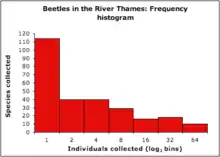
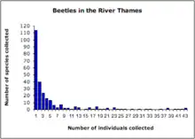
Relative species abundances follow very similar patterns over a wide range of ecological communities. When plotted as a histogram of the number of species represented by 1, 2, 3, ..., n individuals usually fit a hollow curve, such that most species are rare, (represented by a single individual in a community sample) and relatively few species are abundant (represented by a large number of individuals in a community sample)(Figure 1).[4] This pattern has been long-recognized and can be broadly summarized with the statement that "most species are rare".[5] For example, Charles Darwin noted in 1859 in The Origin of Species that "... rarity is the attribute of vast numbers of species in all classes...."[6]
Species abundance patterns can be best visualized in the form of relative abundance distribution plots. The consistency of relative species abundance patterns suggests that some common macroecological "rule" or process determines the distribution of individuals among species within a trophic level.
Distribution plots
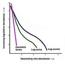
Relative species abundance distributions are usually graphed as frequency histograms ("Preston plots"; Figure 2)[7] or rank-abundance diagrams ("Whittaker Plots"; Figure 3).[8]
Frequency histogram (Preston plot):
- x-axis: logarithm of abundance bins (historically log2 as a rough approximation to the natural logarithm)
- y-axis: number of species at given abundance
Rank-abundance diagram (Whittaker plot):
- x-axis: species list, ranked in order of descending abundance (i.e. from common to rare)
- y-axis: logarithm of % relative abundance
When plotted in these ways, relative species abundances from wildly different data sets show similar patterns: frequency histograms tend to be right-skewed (e.g. Figure 2) and rank-abundance diagrams tend to conform to the curves illustrated in Figure 4.
Understanding relative species abundance patterns
Researchers attempting to understand relative species abundance patterns usually approach them in a descriptive or mechanistic way. Using a descriptive approach biologists attempt to fit a mathematical model to real data sets and infer the underlying biological principles at work from the model parameters. By contrast, mechanistic approaches create a mathematical model based on biological principles and then test how well these models fit real data sets.[9]
Descriptive approaches
Geometric series (Motomura 1932)
I. Motomura developed the geometric series model based on benthic community data in a lake.[12] Within the geometric series each species' level of abundance is a sequential, constant proportion (k) of the total number of individuals in the community. Thus if k is 0.5, the most common species would represent half of individuals in the community (50%), the second most common species would represent half of the remaining half (25%), the third, half of the remaining quarter (12.5%) and so forth.
Although Motomura originally developed the model as a statistical (descriptive) means to plot observed abundances, the "discovery" of his paper by Western researchers in 1965 led to the model being used as a niche apportionment model – the "niche-preemption model".[8] In a mechanistic model k represents the proportion of the resource base acquired by a given species.
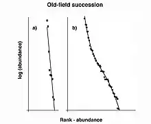
The geometric series rank-abundance diagram is linear with a slope of –k, and reflects a rapid decrease in species abundances by rank (Figure 4).[12] The geometric series does not explicitly assume that species colonize an area sequentially, however, the model fits the concept of niche preemption, where species sequentially colonize a region and the first species to arrive receives the majority of resources.[13] The geometric series model fits observed species abundances in highly uneven communities with low diversity.[13] This is expected to occur in terrestrial plant communities (as these assemblages often show strong dominance) as well as communities at early successional stages and those in harsh or isolated environments (Figure 5).[8]
Logseries (Fisher et al 1943)
where:
- S = the number of species in the sampled community
- N = the number of individuals sampled
- = a constant derived from the sample data set
The logseries was developed by Ronald Fisher to fit two different abundance data sets: British moth species (collected by Carrington Williams) and Malaya butterflies (collected by Alexander Steven Corbet).[14] The logic behind the derivation of the logseries is varied[15] however Fisher proposed that sampled species abundances would follow a negative binomial from which the zero abundance class (species too rare to be sampled) was eliminated.[1] He also assumed that the total number of species in a community was infinite. Together, this produced the logseries distribution (Figure 4). The logseries predicts the number of species at different levels of abundance (n individuals) with the formula:
where:
- S = the number of species with an abundance of n
- x = a positive constant (0 < x < 1) which is derived from the sample data set and generally approaches 1 in value
The number of species with 1, 2, 3, ..., n individuals are therefore:
Fisher’s constants
The constants α and x can be estimated through iteration from a given species data set using the values S and N.[2] Fisher's dimensionless α is often used as a measure of biodiversity, and indeed has recently been found to represent the fundamental biodiversity parameter θ from neutral theory (see below).
Log normal (Preston 1948)
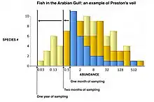
Using several data sets (including breeding bird surveys from New York and Pennsylvania and moth collections from Maine, Alberta and Saskatchewan) Frank W. Preston (1948) argued that species abundances (when binned logarithmically in a Preston plot) follow a normal (Gaussian) distribution, partly as a result of the central limit theorem (Figure 4).[7] This means that the abundance distribution is lognormal. According to his argument, the right-skew observed in species abundance frequency histograms (including those described by Fisher et al. (1943)[14]) was, in fact, a sampling artifact. Given that species toward the left side of the x-axis are increasingly rare, they may be missed in a random species sample. As the sample size increases however, the likelihood of collecting rare species in a way that accurately represents their abundance also increases, and more of the normal distribution becomes visible.[7] The point at which rare species cease to be sampled has been termed Preston's veil line. As the sample size increases Preston's veil is pushed farther to the left and more of the normal curve becomes visible[2][10](Figure 6). Williams' moth data, originally used by Fisher to develop the logseries distribution, became increasingly lognormal as more years of sampling were completed.[1][3]
Calculating theoretical species richness
Preston's theory has an application: if a community is truly lognormal yet under-sampled, the lognormal distribution can be used to estimate the true species richness of a community. Assuming the shape of the total distribution can be confidently predicted from the collected data, the normal curve can be fit via statistical software or by completing the Gaussian formula:[7]
where:
- n0 is the number of species in the modal bin (the peak of the curve)
- n is the number of species in bins R distant from the modal bin
- a is a constant derived from the data
It is then possible to predict how many species are in the community by calculating the total area under the curve (N):
The number of species missing from the data set (the missing area to the left of the veil line) is simply N minus the number of species sampled.[2] Preston did this for two lepidopteran data sets, predicting that, even after 22 years of collection, only 72% and 88% of the species present had been sampled.[7]
Yule model (Nee 2003)
The Yule model is based on a much earlier, Galton–Watson model which was used to describe the distribution of species among genera.[16] The Yule model assumes random branching of species trees, with each species (branch tip) having the equivalent probability of giving rise to new species or becoming extinct. As the number of species within a genus, within a clade, has a similar distribution to the number of individuals within a species, within a community (i.e. the "hollow curve"), Sean Nee (2003) used the model to describe relative species abundances.[4][17] In many ways this model is similar to niche apportionment models, however, Nee intentionally did not propose a biological mechanism for the model behavior, arguing that any distribution can be produced by a variety of mechanisms.[17]
Mechanistic approaches: niche apportionment
Note: This section provides a general summary of niche apportionment theory, more information can be found under niche apportionment models.
Most mechanistic approaches to species abundance distributions use niche-space, i.e. available resources, as the mechanism driving abundances. If species in the same trophic level consume the same resources (such as nutrients or sunlight in plant communities, prey in carnivore communities, nesting locations or food in bird communities) and these resources are limited, how the resource "pie" is divided among species determines how many individuals of each species can exist in the community. Species with access to abundant resources will have higher carrying capacities than those with little access. Mutsunori Tokeshi[18] later elaborated niche apportionment theory to include niche filling in unexploited resource space.[9] Thus, a species may survive in the community by carving out a portion of another species' niche (slicing up the pie into smaller pieces) or by moving into a vacant niche (essentially making the pie larger, for example, by being the first to arrive in a newly available location or through the development of a novel trait that allows access previously unavailable resources). Numerous niche apportionment models have been developed. Each make different assumptions about how species carve up niche-space.
Unified neutral theory (Hubbell 1979/2001)
The Unified Neutral Theory of Biodiversity and Biogeography (UNTB) is a special form of mechanistic model that takes an entirely different approach to community composition than the niche apportionment models.[1] Instead of species populations reaching equilibrium within a community, the UNTB model is dynamic, allowing for continuing changes in relative species abundances through drift.
A community in the UNTB model can be best visualized as a grid with a certain number of spaces, each occupied with individuals of different species. The model is zero-sum as there are a limited number of spaces that can be occupied: an increase in the number of individuals of one species in the grid must result in corresponding decrease in the number of individuals of other species in the grid. The model then uses birth, death, immigration, extinction and speciation to modify community composition over time.
- Hubbell's theta
The UNTB model produces a dimensionless "fundamental biodiversity" number, θ, which is derived using the formula:
- θ = 2Jmv
where:
- Jm is the size of the metacommunity (the outside source of immigrants to the local community)
- v is the speciation rate in the model
Relative species abundances in the UNTB model follow a zero-sum multinomial distribution.[19] The shape of this distribution is a function of the immigration rate, the size of the sampled community (grid), and θ.[19] When the value of θ is small, the relative species abundance distribution is similar to the geometric series (high dominance). As θ gets larger, the distribution becomes increasingly s-shaped (log-normal) and, as it approaches infinity, the curve becomes flat (the community has infinite diversity and species abundances of one). Finally, when θ = 0 the community described consists of only one species (extreme dominance).[1]
Fisher's alpha and Hubbell's theta – an interesting convergence
An unexpected result of the UNTB is that at very large sample sizes, predicted relative species abundance curves describe the metacommunity and become identical to Fisher's logseries. At this point θ also becomes identical to Fisher's for the equivalent distribution and Fisher's constant x is equal to the ratio of birthrate : deathrate. Thus, the UNTB unintentionally offers a mechanistic explanation of the logseries 50 years after Fisher first developed his descriptive model.[1]
References
- 1 2 3 4 5 6 7 8 9 Hubbell, S. P. 2001. The unified neutral theory of biodiversity and biogeography. Princeton University Press, Princeton, N.J.
- 1 2 3 4 5 6 7 Magurran, A. E. 2004. Measuring biological diversity. Blackwell Scientific, Oxford.
- 1 2 3 4 Williams, C.B. 1964. Patterns in the balance of nature and related problems in quantitative ecology. Academic Press, London.
- 1 2 3 McGill, B. J., Etienne R. S., Gray J. S., Alonso D., Anderson M. J., Benecha H. K., Dornelas M., Enquist B. J., Green J. L., He F., Hurlbert A. H., Magurran A. E., Marquet P. A., Maurer B. A., Ostling A., Soykan C. U., Ugland K. I., White E. P. 2007. "Species abundance distributions: moving beyond single prediction theories to integration within an ecological framework". Ecology Letters 10: 995–1015
- ↑ Andrewartha, H. G.; Birch L. C. 1954. The Distribution and Abundance of Animals. The University of Chicago Press, Chicago, Illinois.
- ↑ Darwin, C. 2004 (1859). The Origin of Species by means of natural selection or the preservation of favoured races in the struggle for life. Castle Books, New Jersey.
- 1 2 3 4 5 Preston, F. W. (1948). "The Commonness, and Rarity, of Species" (PDF). Ecology. 29 (3): 254–283. doi:10.2307/1930989. JSTOR 1930989.
- 1 2 3 Whittaker, R. H. 1965. "Dominance and diversity in land plant communities", Science 147: 250–260
- 1 2 Tokeshi, M. 1999. Species coexistence: ecological and evolutionary perspectives. Blackwell Scientific, Oxford
- 1 2 Magurran, A. E. 1988. Ecological Diversity and Its Measurement. Princeton Univ. Press
- ↑ Whittaker, R. H. 1972. "Evolution and measurement of species diversity". Taxon 21:213–251
- 1 2 Motomura, I. 1932. "A statistical treatment of associations", Japanese Journal of Zoology. 44: 379–383 (in Japanese)
- 1 2 He , F., Tang D. 2008. "Estimating the niche preemption parameter of the geometric series" Acta Oecologica 33 (1):105–107
- 1 2 Fisher, R. A; Corbet, A. S.; Williams, C. B. 1943. "The relation between the number of species and the number of individuals in a random sample of an animal population". Journal of Animal Ecology 12: 42–58.
- ↑ Johnson, J. L.; Adrienne, W. K.; Kotz, S. (2005). Univariate and Discrete Distributions, 3rd edn. John Wiley and Sons, New York
- ↑ Yule, G. U. 1924. "A mathematical theory of evolution based on the conclusions of Dr. J. C. Willis, FRS". Philosophical Transactions of the Royal Society B 213: 21–87
- 1 2 Nee, S. 2003. "The unified phenomenological theory of biodiversity". In T. Blackburn and K. Gaston, editors, Macroecology: concepts and consequences. Blackwell Scientific, Oxford.
- ↑ Tokeshi, M. 1990. "Niche apportionment or random assortment: species abundance patterns revisited". Journal of Animal Ecology 59: 1129–1146
- 1 2 Hubbell, S. P.; Lake J. 2003. "The neutral theory of biogeography and biodiversity: and beyond". In T. Blackburn and K. Gaston, editors, Macroecology: concepts and consequences. Blackwell Scientific, Oxford.
